Dollar Shave Club's Member Profile
Expanding the use of a member profile questionnaire to all platforms and making personalized product recommendations
DollAR SHAVE CLUB
I was a noob, but I learned a lot during the Summer of 2017 working with the brightest UX minds of DSC. I had the opportunity to work on customer-facing product and e-commerce. While I worked primarily in UX Design, I also had the opportunity to work at client-side pace alongside our developers, engineers, and QA analysts with production being in-house.
My Role: UX Intern
I worked with an entire design team on this project during my Summer 2017 internship at Dollar Shave Club. While working alongside the UX Lead, I was given the responsibilities of creating and exploring different directions through wires and creating the entire prototype for user-testing from the ground up.
PROBLEM
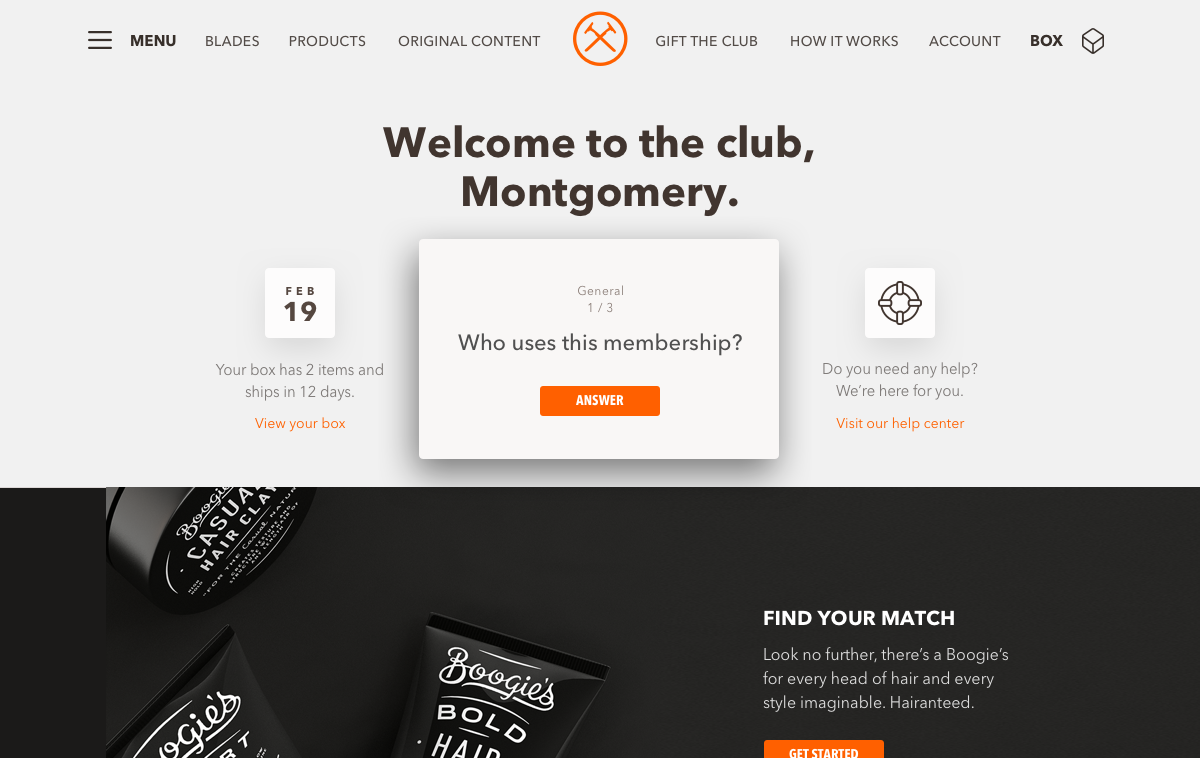
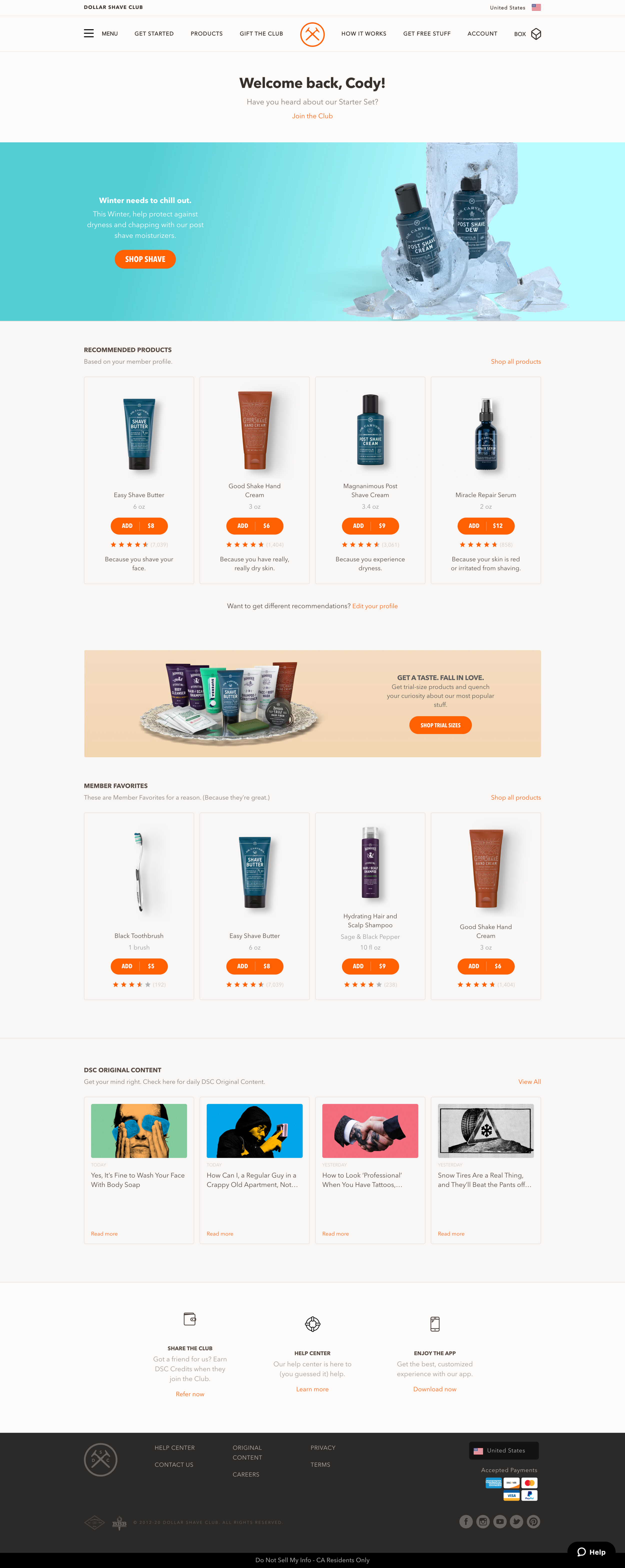
Dollar Shave Club introduced a great utility in Member Profile. Users could answer questions about their:
- Grooming habits
- Styling habits
- Skin care habits
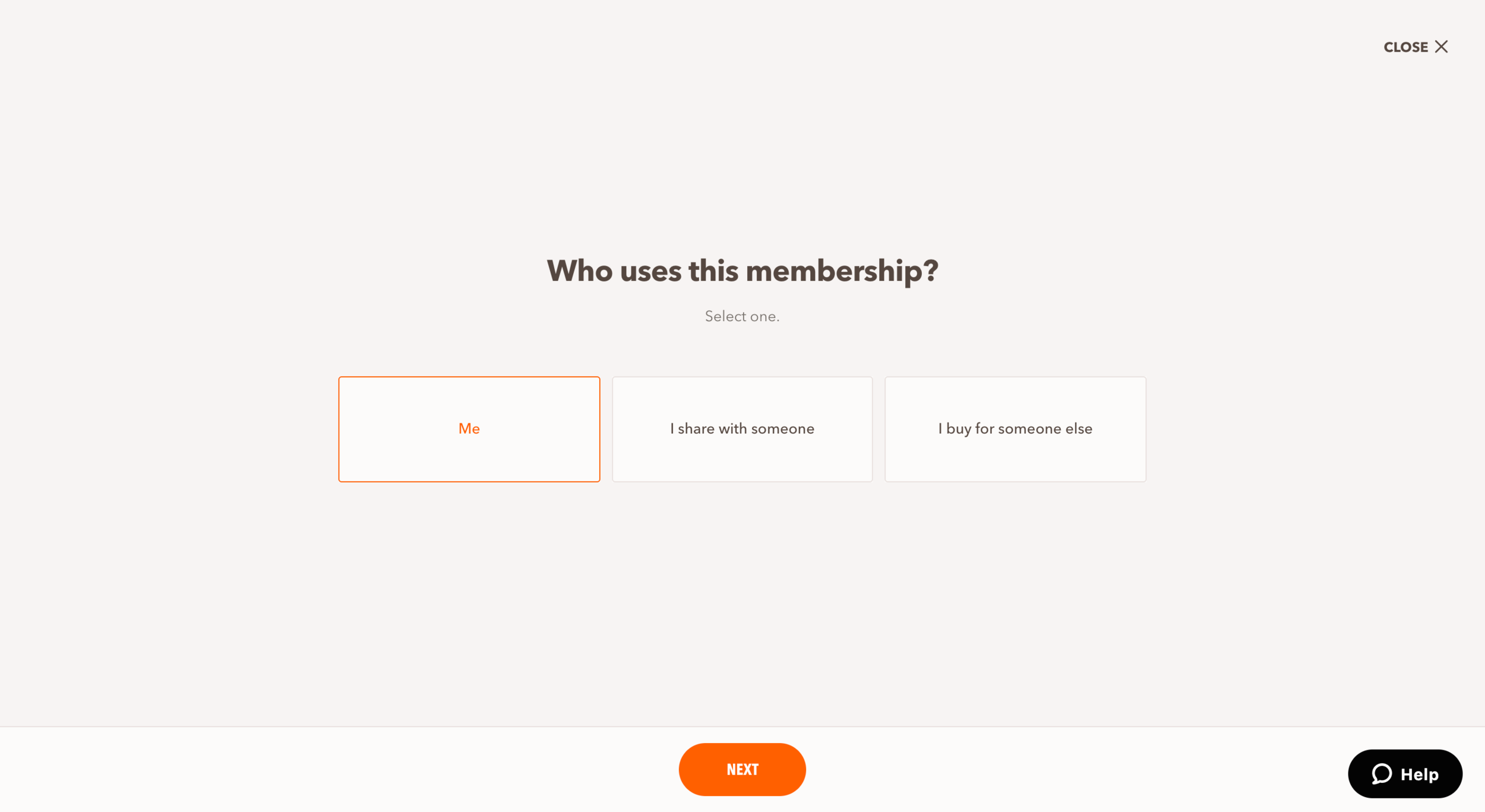
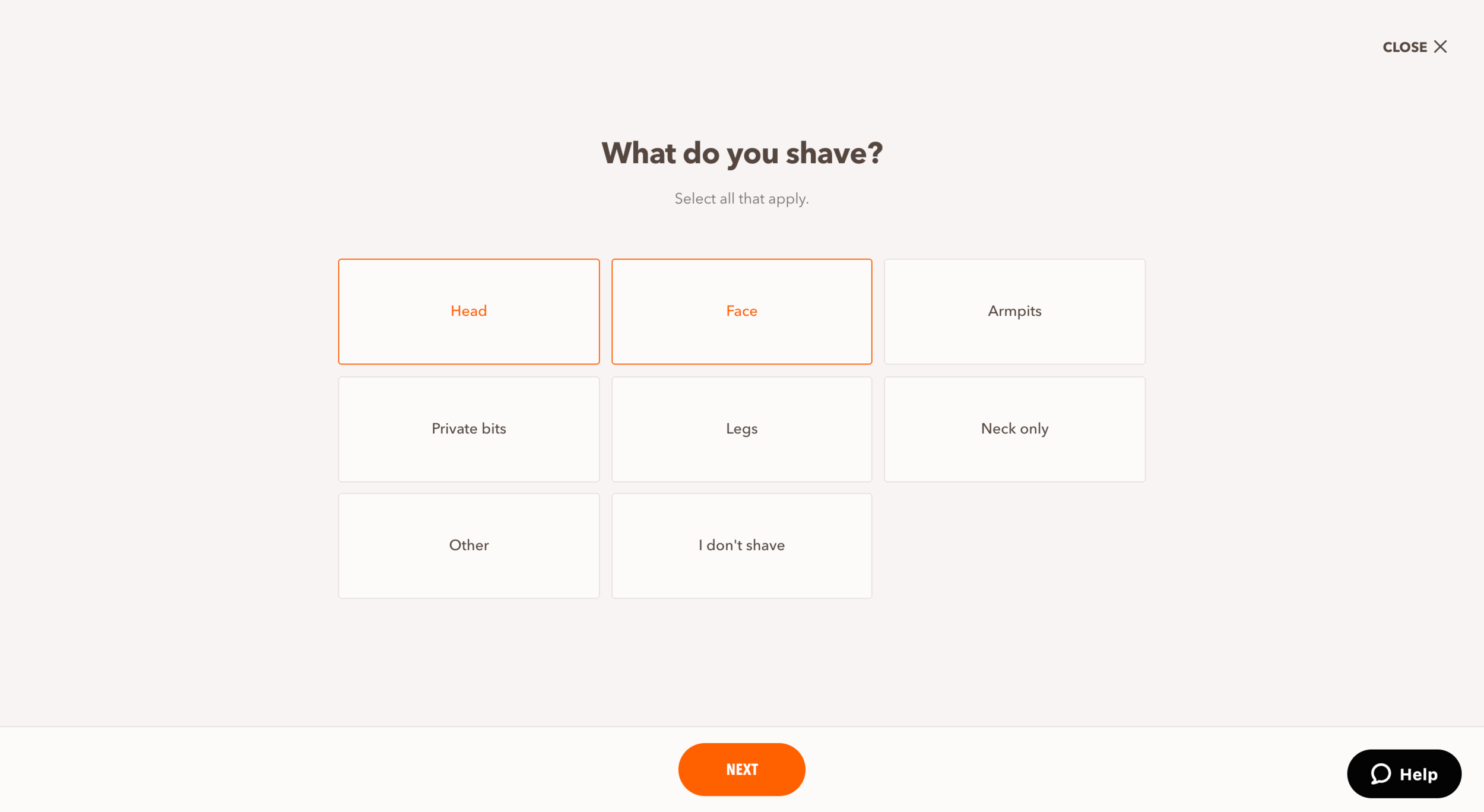
From those answers, DSC could recommend products and services catered directly to those answers. The one problem that faced this platform was that it was for iOS only.
THE TASK
Expand Member Profile from iOS to Android, desktop and mobile to improve overall user experience.
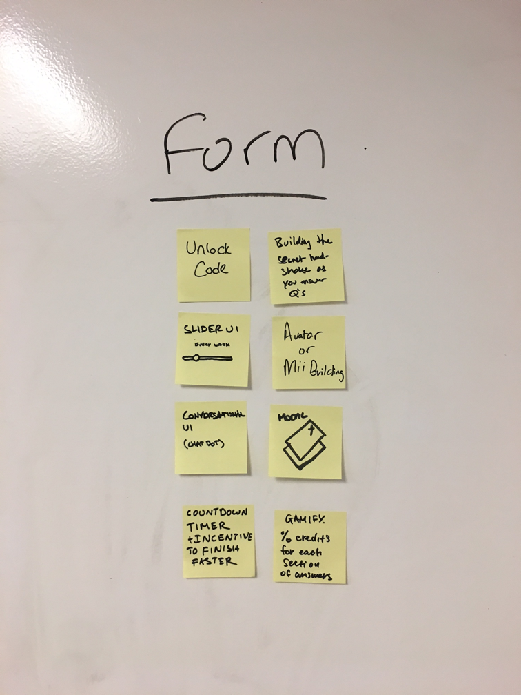
BRAINSTORMING
The project team, which consisted of designers, researchers, project managers, and a copywriter participated in the brainstorm for this project. We approached our problem from these angles:

- Trigger: how our users are getting into the member profile
- Home: where the member profile lives
- Form: the features and design objectives we'd like to incorporate
- Reward: what users would get out of completing their profile
As defined with the user needs listed above, we started throwing ideas at the wall to see what stuck.
Finding the solution
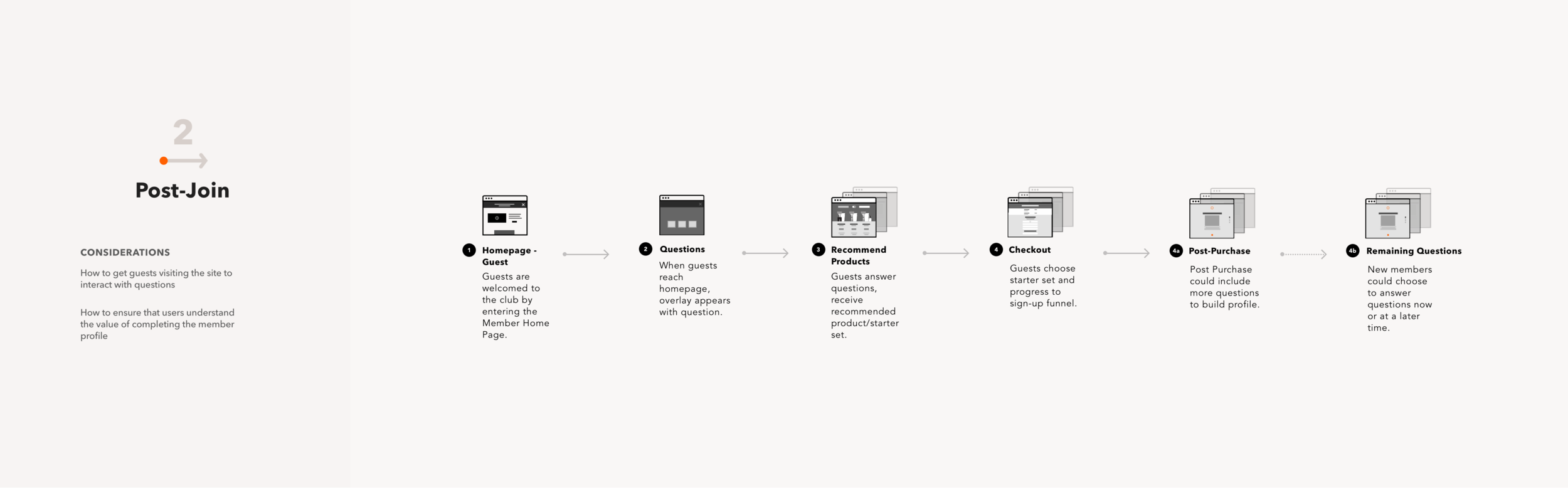
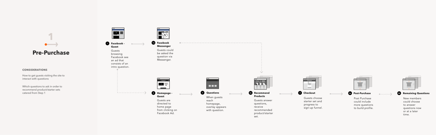
Moving to the ideation phase, the UX Lead and I met one-on-one to discuss design direction for the relaunch of member profile.
Together, we mapped out the experience from start to finish with our initial ideas. The first image shows that map, which carries the user from being picked up on DSC's site of Facebook through the entire member profile process and ends with users seeing recommendations.
Getting users to bite
Members who typically didn't visit the website needed to be notified, so we included the information about member profile in the member's monthly email from the club. We also attempted to use Facebook as a method of making sure that users knew about the questionnaire before joining. Another possibility for outreach around the initiative came in the form of a physical insert in the member's monthly box.

Another opportunity to reach members came in the form of the returning-customer landing-page, or RCLP. Placing a module on the RCLP that pushed our customers back to our questionnaire was an easy way to ensure that customers would complete the process.
Power of the brand
The Dollar Shave Club brand has a voice that is easily distinguishable. No other commercial brand can openly talk about things that happen in the bathroom. With that in mind, the task of designing is both easier and more difficult.
I embraced this voice in my designs and my thinking. If I can be brutally honest with my users, I can be brutally honest and simple with my designs. The aesthetic that went into the visual design was just that, brutally simple and clean. Designing this way left no meat on the bone.
Testing the feature
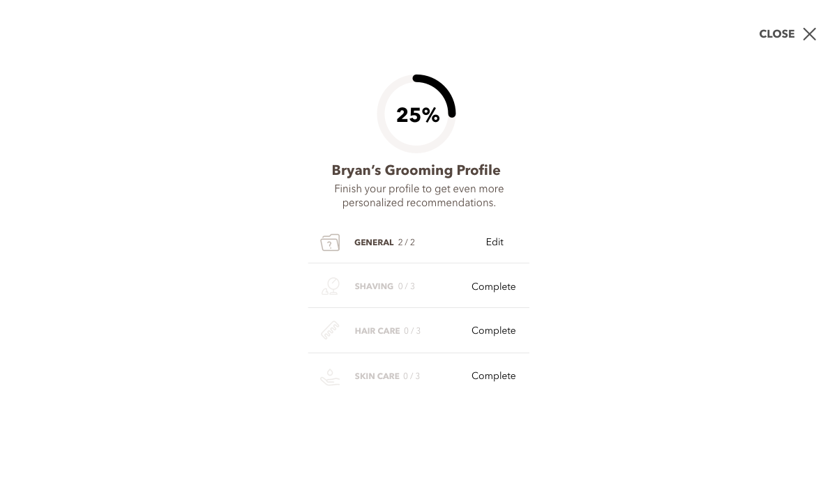
After helping design the new flow and assets, I was assigned with building the usability prototype that would be tested. We used Usertesting.com for our feedback, and along with the UX Research team, we were able to gain valuable information regarding the new system. Some of the recommendations made by the users we tested ranged from having some kind of progress meter to increasing the feedback they received during the process.
Takeaways
I got my hands dirty during this internship. Working client-side is completely different from what I expected. I loved the parts where I got to work one-on-one with my devs and engineers. The handoff process was not just a pass and go situation. I worked closely with a QA intern, which also helped me see where my design flaws were and I was able to redesign and help make decisions throughout production of my projects. The speed is also completely different, as projects move and disappear much faster. Working client-side also gave me a taste of the bureaucracy that happens there. Not all of the people in charge fully believe in the power of UX, but that's up to us to change. People like me are the future of this industry, and I have to fight for that.
Let’s talk about process, Baby!
Below, I’ll share screenshots of my process, including things like my sketch file and annotations from the work on this project. As a designer, I know that process is important, but I find it more valuable to be able to talk through your process instead of writing it on a page. If you’d like to learn more about my process, let’s chat!