Virginia State University
A digital remodeling of an HBCU
Introduction
As the UX Analyst on this project, I worked alongside another UX Architect in tandem to create usability studies and write scripts for our surveys and usability studies. On my own, I led the wireframing initiative along with presenting the initial designs to the clients and led a number of moderated usability tests on our final prototype. I used Sketch along with Craft and InVision to create this experience and prototype. Finally, with our current landscape with moderated testing, I used WebEX with screen-sharing to gather feedback on our final prototype.
My Role: UX designer

Virginia State University
VSU has a rich history and is honored to hold the title of one of the longest running HBCUs in the country. Residing in the category alongside some other prestigious schools like Howard, VSU has to keep up with some great websites and digital ecosystems. The year is 2020, and VSU was still using a website that resembled something you’d see in 2009. While functional, the website would very quickly alienate you deep within menus and stifled navigation structures. This led to high bounce rates, frustrated users, and never ending mazes that failed to lead you to the information you were seeking.
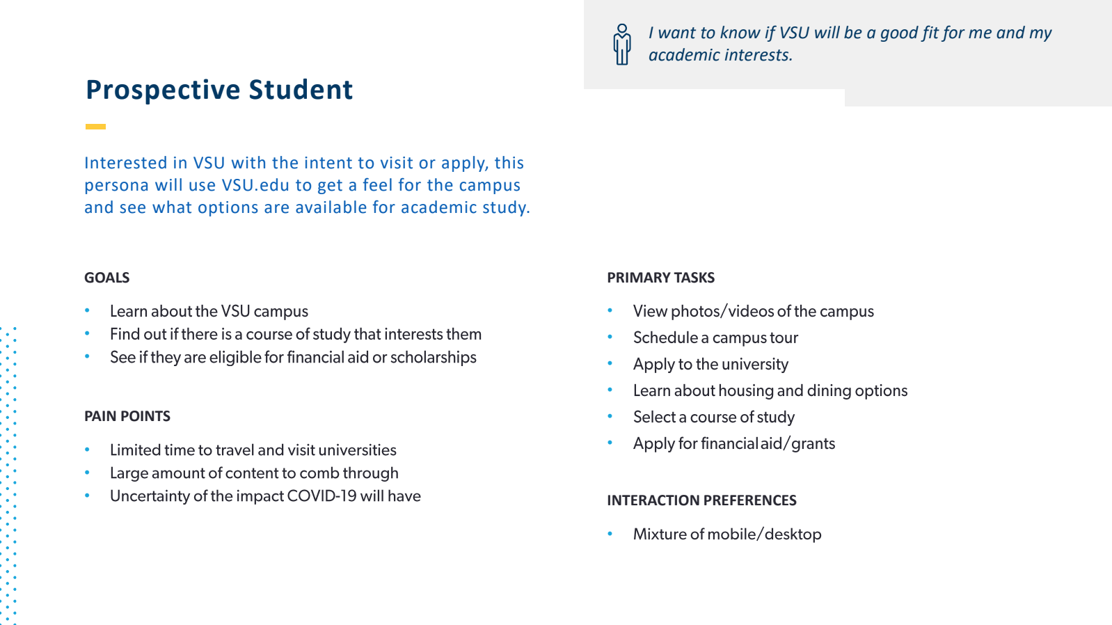
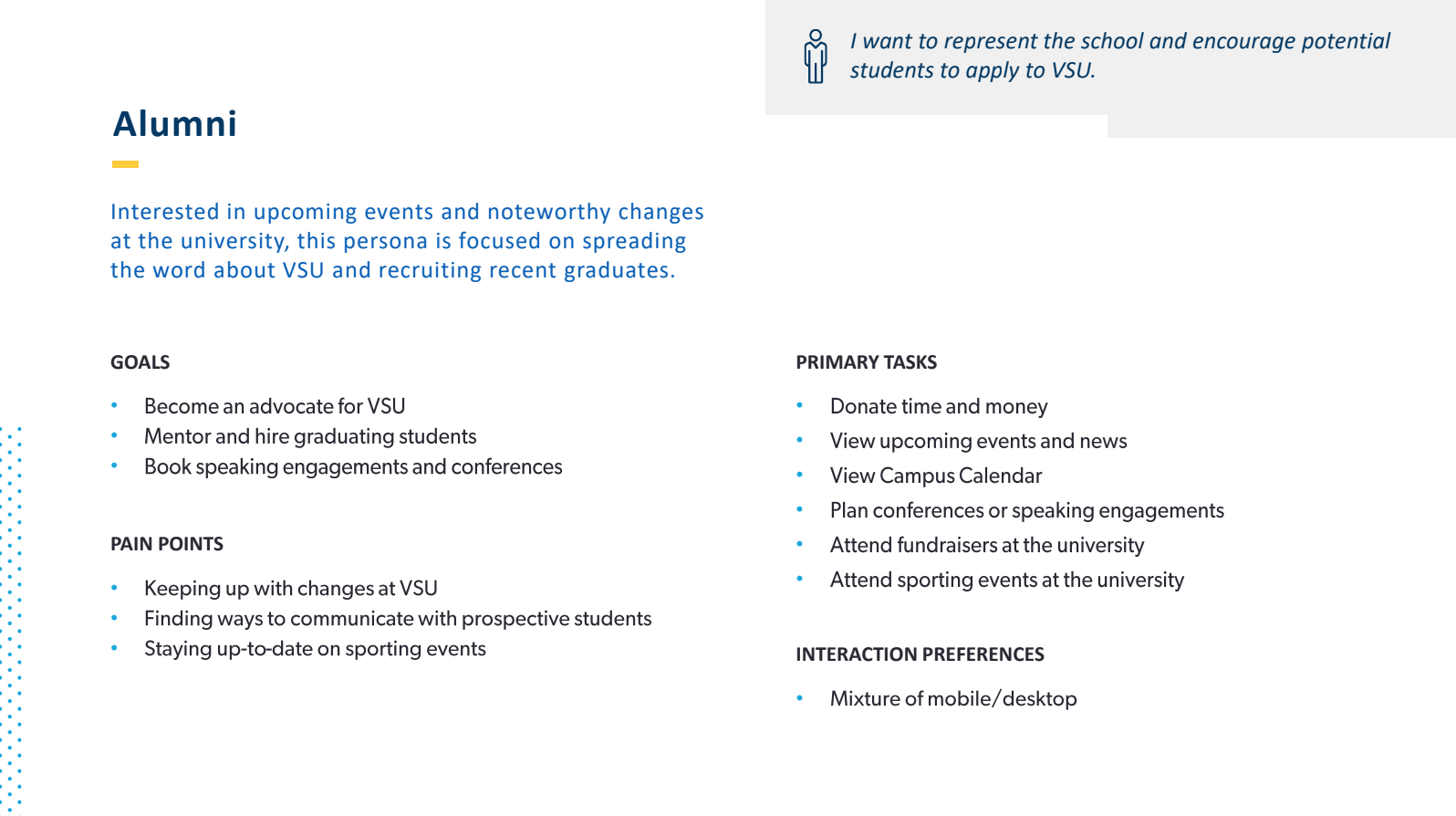
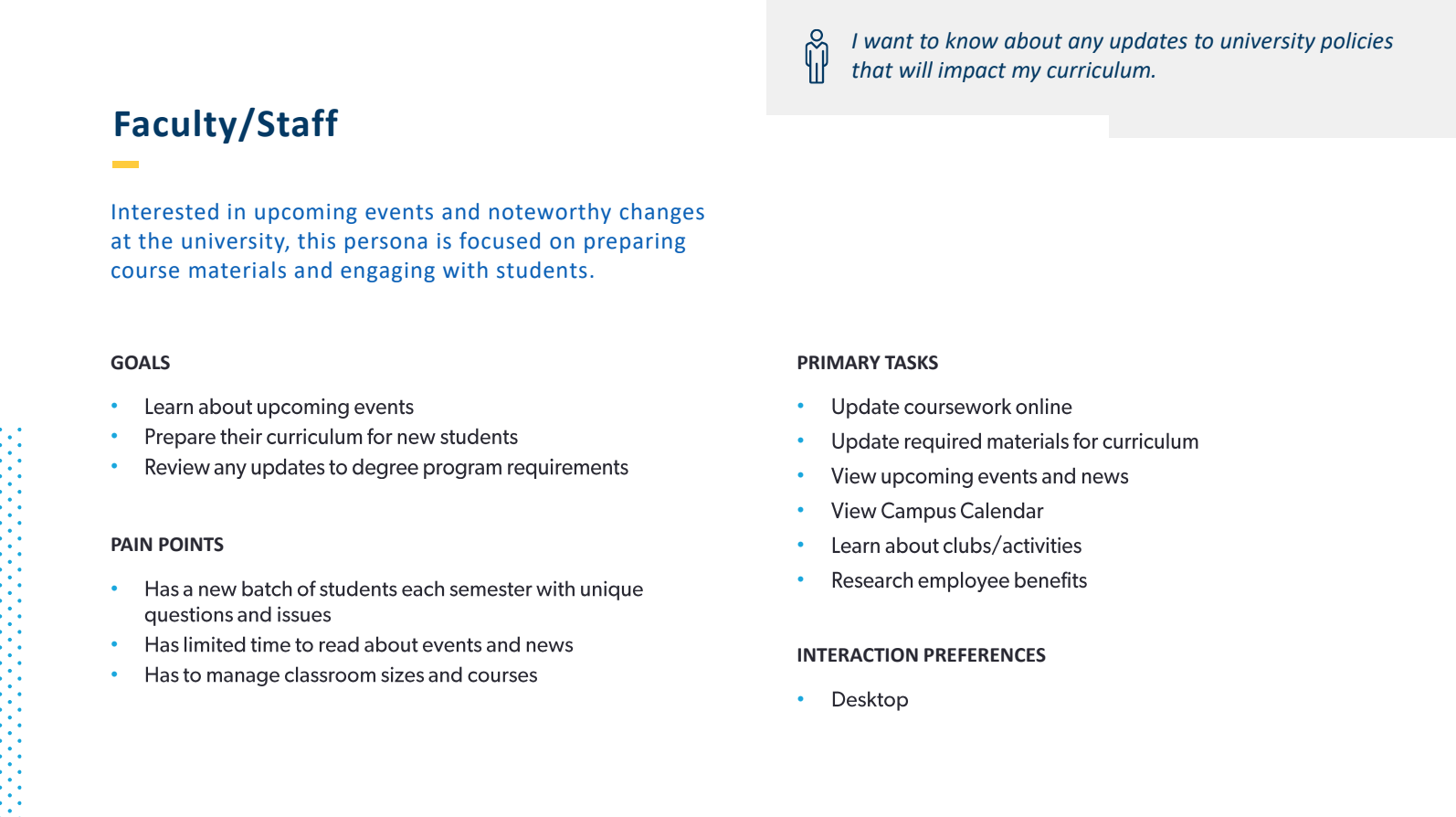
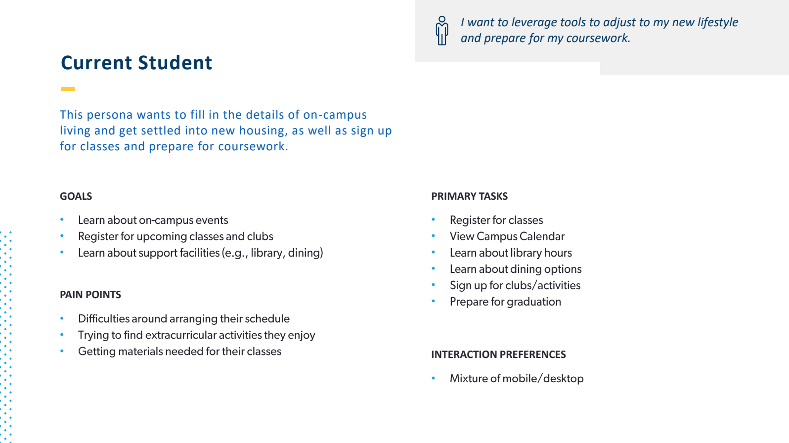
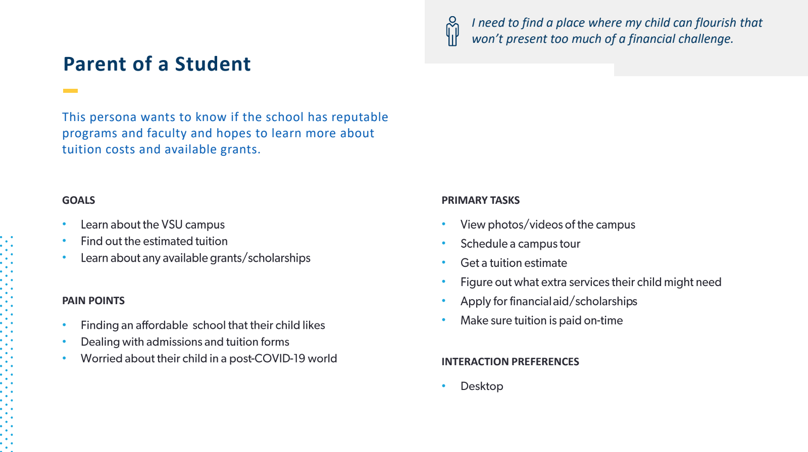
Our initial information gathering was extremely important. We started by surveying our users. We needed to survey our user base to find out exactly what pain-points they faced while using the site. We made initial assumptions in what our eventual personas would be, which included students (both current and perspective), as well as parents, alumni, and faculty/staff. Those initial assumptions did end up becoming or user base, but we had to make sure to break down the experience for each persona.


Next, it was time to take our survey finds and create personas. Like I noted above, I had assumptions on our users groups, and those assumptions came to fruition. I sorted our users into five distinct groups. The groups were: current students, prospective students, faculty/staff, parents, and alumni. Each group had small distinct differences in their priorities, but across the board, I started to draw lines to connect the commonalities. The users had one core need, finding information. I made sure to incorporate into the personas, sure, but making sure that this was present in the designs we pivotal.
Once our personas were created and we knew the general flow we needed to follow, it was time to get to the fun stuff! I started, as I usually do, by putting pen to paper and began wireframing. For this project, the deliverables called for me to create page templates instead of designing every single page. For reference, we had more than 100 individual pages of information. Colleges and Universities have websites that house tons of information, and VSU was no different. With six primary navigation trees that included multiple sub-navigation trees as well, it was critical that we made information very easy to find and used an organizational hierarchy that allowed users to skim and find exactly where they needed to go.
I chose, after a few different iterations, to have a basic nav structure with a mega-nav option that opened on click. There was also going to be a global header nav that included easy access to links for all of our personas. These resource links are ~80% of the reasons users visit the homepage. This reduced clutter on the page and allowed users to easily find where the needed to go with one single click. Beyond that, we faced another challenge. Historically, pages for each individual college within the university needed to have their own navigation structure because they also had their own information to display. For this, I decided to have each college have its own instance of the primary nav with an easy click to return to the parent nav structure. What that meant was that upon users reaching a college page, they would be greeted with a new nav that looked similar, but housed all the necessary information for that instance. By simply clicking the VSU logo, users would be returned to the parent page and the original primary nav structure. This went over extremely well with users in our usability studies, which we’ll get into a little later on.
Upon completing our design phase during our second sprint, it was time to start putting this site in front of users. My partner and I took turns performing moderated usability studies with a prototype I built from the visual designs adapted from the wireframes. We took advantage of each of the different personas in our UX research to make sure that we had input on final designs from all perspectives. Some of the major takeaways were that information was immediately easier to find. Multiple users raved about the clean design and hierarchy by claiming that all of the information made sense and was easy to navigate. Our results did offer us a couple areas of opportunity, but they were mostly visual updates.


The bottom line & What i learned
This project was extremely rewarding for me. I led the initiatives on wires and did a good bit of work in the usability and research space. This was my third opportunity to work with 508 accessibility. Within this framework, it was a bit different to bring it to life in a college or educational space instead of a government organization. The main takeaways there were around how we were able to cratively bring to life this site and give users the ability to feel like they were part of something bigger. With universities, I learned that it’s not all about the content you show, but how you show it. You want your users to feel like they are part of a bigger picture. You want them to feel like they are on campus and can feel the atmosphere.
Students, parents, and alumni alike are all after one goal at the end of the day. That goal is information. This project didn’t only come with positives, as there were also challenges. The challenges we faced were on the client side of the table. During our usual presentations at the end of sprints, silence is usually what our work and progress was met with. While we’ll never complain about not getting any feedback, it is challenging to know you are headed in the right direction. We did end up overcoming this challenge later on in the project, however. During a few of our last meetings, one of the key stakeholders finally started coming to the table with conversation items. We also prepared ourselves with talking points going into meetings to generate conversation, which also helped. All in all, this was a very positive and learning experience for me.

A final look at some more of my process
Below, I’ll share a collection screenshots from my process shown above, including things like my sketch file and annotations from the work on this project.


